You don’t read a data visual in your presentation the way you read a page of text. As soon as the slide appears, your gaze immediately shoots to the graph or image. Only then does the title come into focus.
In those first few seconds, our brain does something frenzied and sometimes risky. It uses unconscious expectations and draws conclusions in an instant. That’s helpful, but it also makes us susceptible to misinterpretation.
If you know how your audience perceives, you can design your visuals so that the main message comes out naturally; without noise, without extra thinking, and without unintended connotations. That’s exactly where good data storytelling begins.
This is how we look at a data visual
When we open a book, it is fairly predictable how our eyes move. We start (in countries with Latin and Cyrillic scripts) at the top of the page, read the title and then begin the text at the top left. When we have read the last word on the bottom right, we move to the next page.
When we look at a slide with a data visual, our eyes move very differently. We don’t start at the top left, let alone the title, but at the visual itself. Our eyes first attach to something that catches our eye on it. Then our gaze slides to the title of the slide, to read what the visual is supposed to represent.
We interpret at lightning speed what we see
Our brain uses all kinds of prior knowledge to interpret quickly. These so-called heuristics, mnemonics, are unconsciously active:
- We are used to time being displayed on the x-axis of a graph, progressing from left to right.
- When a number is displayed, it is usually on the y-axis, with low down and high up.
- Colors have a fixed meaning for us: red is high density or means danger, green means safe, blue represents low density or neutral.
- If equal colors are used, higher saturation means higher number or intensity, less saturation means lower or less.
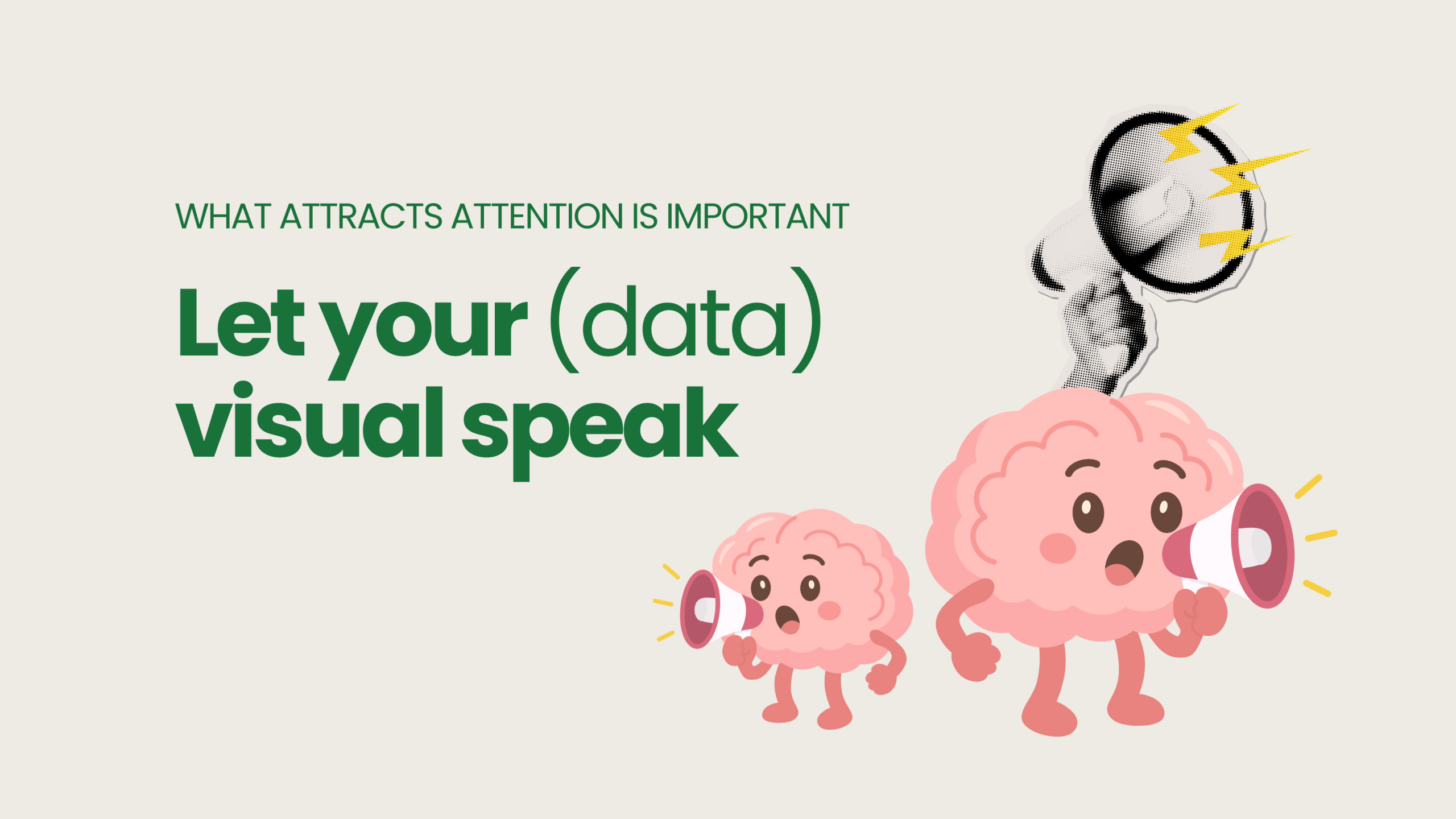
What attracts attention is important (right?).
We look at what stands out, because we are used to the idea that what catches our attention is important. And we look for anomalies: a peak or a valley in a continuous line; the most or least extended bar; a trend up or a trend down; a cluster of plotted dots.
What attracts attention, the deviation, we are used to interpreting in relation to the context, as a cause-and-effect relationship. We turn it into a little story. ‘First this happens, then that happens’. Or, ‘because a happens, b happens.’ And yes, we often mistake correlation for causation.
Gestalt: our brain organizes what we perceive
The Gestalt theory of perception assumes that we automatically group information we see. So our brain constructs patterns, even where they are not there at all. This way of perceiving has the advantage of allowing us to make quick decisions (by perceiving anomalies), but it sometimes overshoots the mark.
According to the Gestalt theory of perception, we group based on a number of principles. And so this is done unconsciously. Those unwritten rules are:
- What is close belongs together.
- Whatever is similar in color or shape (font) belongs together.
- We see continuity, connections in the form of a line.
- When individual parts look like 1 shape together, we see them as a whole.
- There can be 1 thing in the foreground, the rest is then background.
When we perceive, Gestalt theory says, our brain chooses the simplest and clearest form, pushing the other forms into the background. So we do not perceive a data visual for what it is, but discern an arrangement. And if it is not there, we experience it as disturbing, and go looking for it.
Play by the rules
The purpose of data visuals in your presentation is clarity. You want to tell something with them. It should be clear at once, or at least quickly, what you are showing with your visual. Therefore, you make sure that the form in which you display the data does not evoke other meanings in the minds of your audience. You make your data visuals as easy to interpret as possible.
That simplicity is important not only to get your message across quickly and clearly. Because psychological research shows that your audience perceives easily interpreted information as more reliable, than information they have to put effort into. Simplicity is a hallmark of the true, is the unconscious belief.
If you want your data visual to be easy to interpret, you take into account the way people perceive. You follow those unconscious conventions, ensuring that your audience can quickly make sense of your visual. And when you play by the rules, your information “feels” natural and your audience easily comes along with your story.
How do you apply this in your next data visual? 7 tips
Look again at how we interpret, and at the Gestalt theory of perception. And then look at your latest data visual. Try to do that with an open mind, as if seeing it for the first time. Is it clear what is meant by it? Use the following tips:
1. What stands out first
Does the most important information stand out the most? For example, make all supporting bars gray, and that one important bar blue.
2. Check your use of color
Does what is a lot have the darkest hue, and what is less is a less saturated version of that color? Do you use the right colors for the right elements, i.e., red for intense or dangerous, green or blue for safe or more neutral? (There is still something to be said about using green and red, as 8% of men and 0.5% of women see these colors less well to not at all).
3. Organize your information
Put together what belongs together. Add extra white space between groups.
4. Avoid noise
Can you do without the grid? Then leave it out. Are the labels on the axis really necessary, could they be simpler if necessary? Does all data need to be labeled, or do you only need to put a label at the points that require attention?
5. Bring calm to your text
Always use the same font family, be economical with text formatting (bold, italic, underlined). Omit 3D effects or shadows.
6. Give breathing room
Provide enough white space between different sections. Omit what doesn’t add anything. After all, the more “ink” you use, the more your pubic has to subconsciously process.
7. Align neatly
Bring calmness to the slide by aligning the different elements on an imaginary grid. For example, assume 9 imaginary squares (horizontal and vertical divisions in 3), like the ones you can turn on in your camera app, and ensure a balanced composition.
Take a closer look at what works
Over the next few days, try looking at the visuals and slides you see passing by. Resist the temptation you have as an expert to dive right into the content. And see first what catches your attention, and whether your eyes have to do a lot of work to make sense of it. Or is the data visual immediately and almost intuitively understandable? Look and learn!
And want feedback on your data visuals and your slides? Then book a data storytelling workshop for you and your colleagues. In just a few hours we will make a big step towards greater clarity together.
